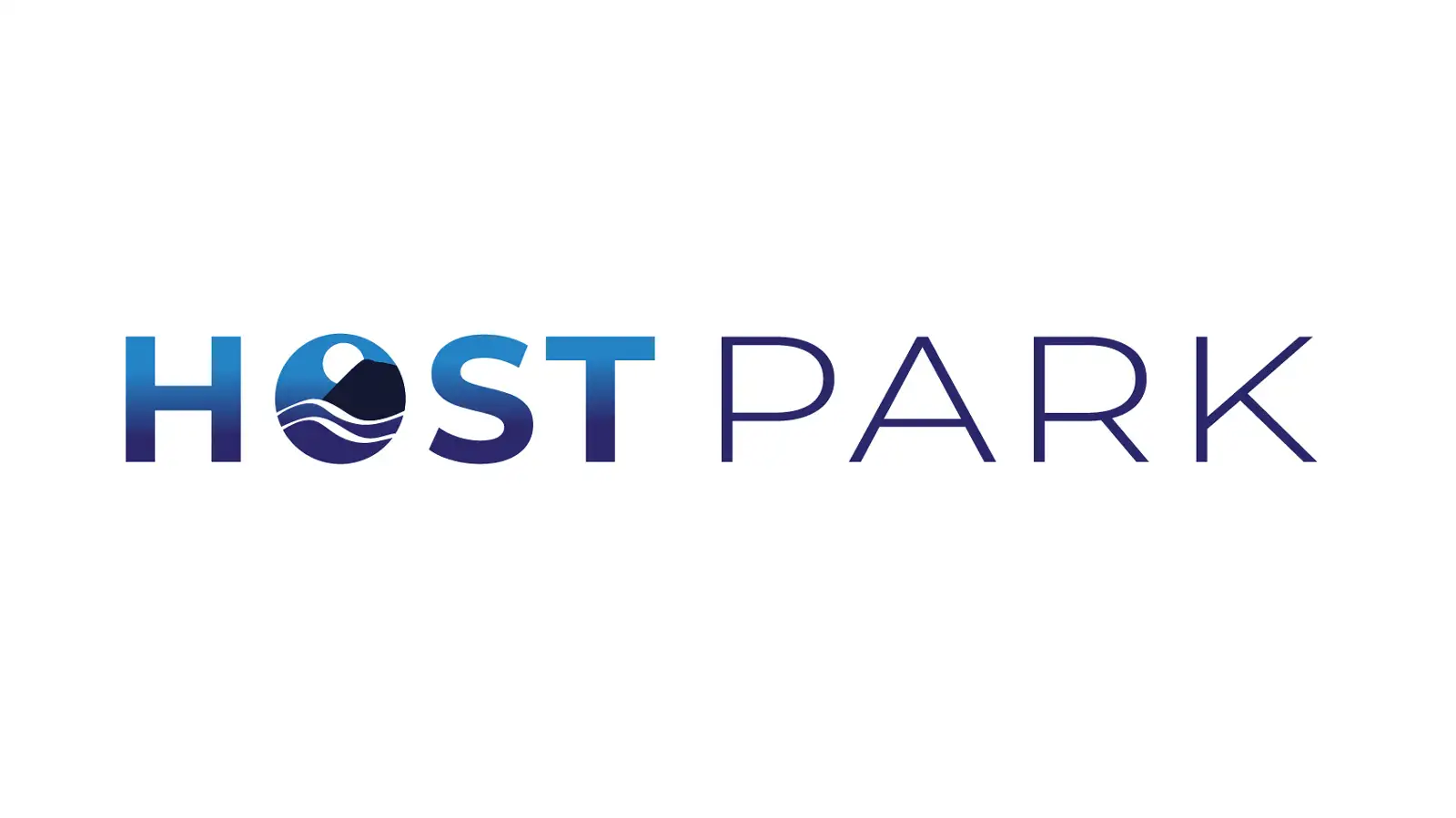
A light brand refresh for HOST Park that retained the recognition and essence of the original NELHA logo while establishing a distinct visual identity. Custom logo variations, gradient treatments, and icon illustrations created a cohesive brand system across digital and print touchpoints.
NELHA's existing logo is striking and has strong recognition, but it represents the parent organization rather than HOST Park specifically. The goal was to create a visual identity for HOST Park that felt connected to NELHA but had its own presence.
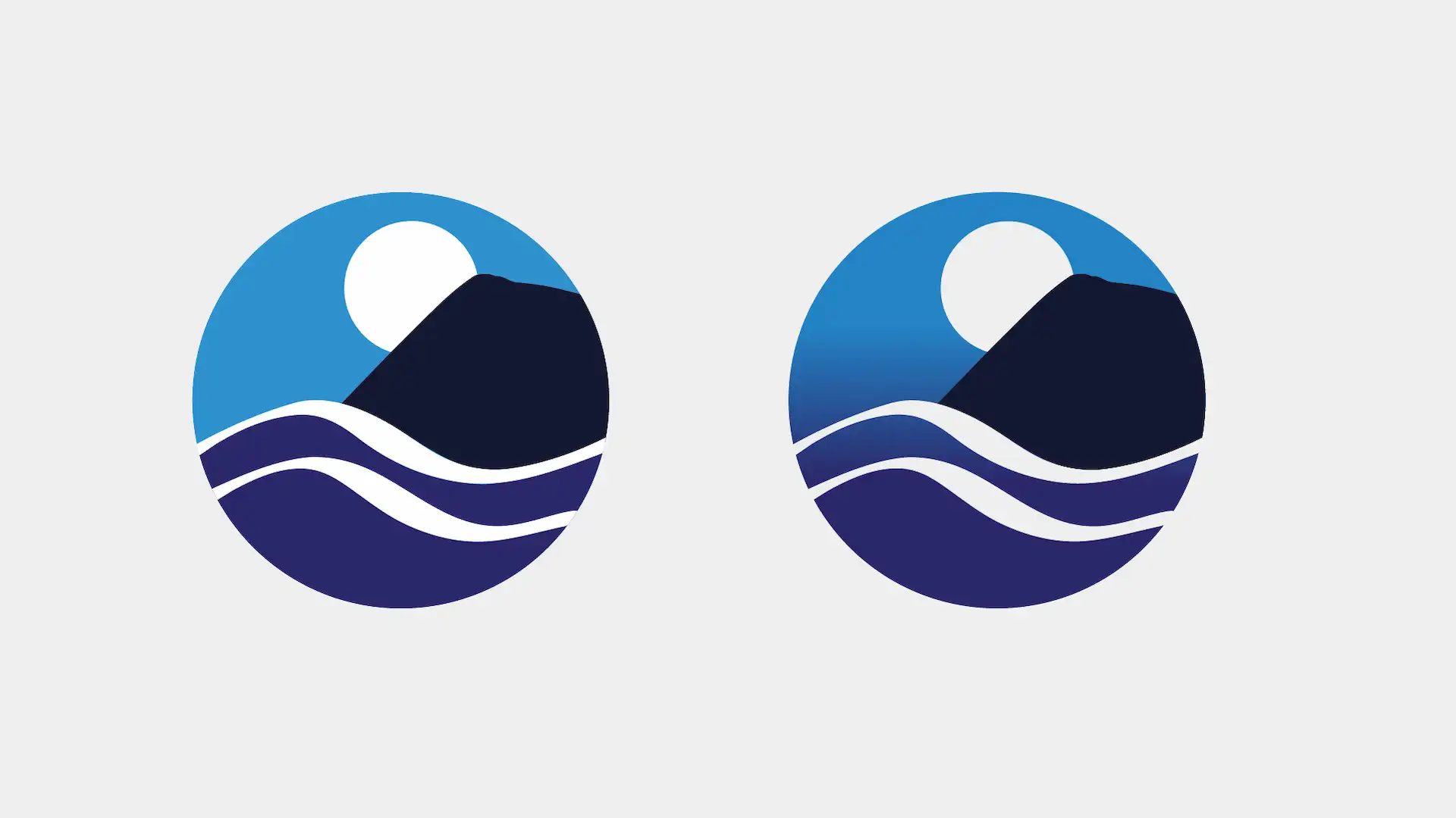
I started by working with the original NELHA logo geometry. Using clipping masks, I created a circular logo form that would become the foundation for the HOST Park identity. To balance the composition within the round mask, I extended the mountain shape and ocean lines from the original vector artwork, redrawing them while keeping the original geometry intact.
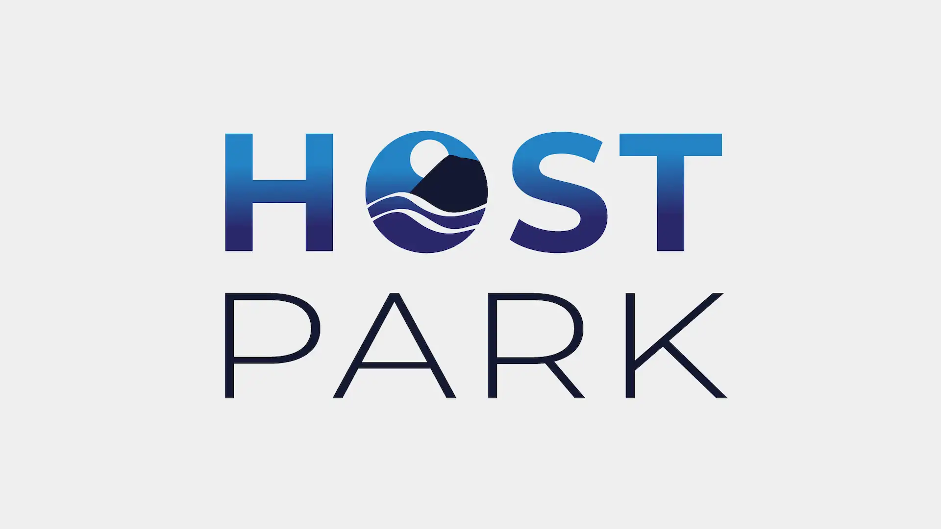
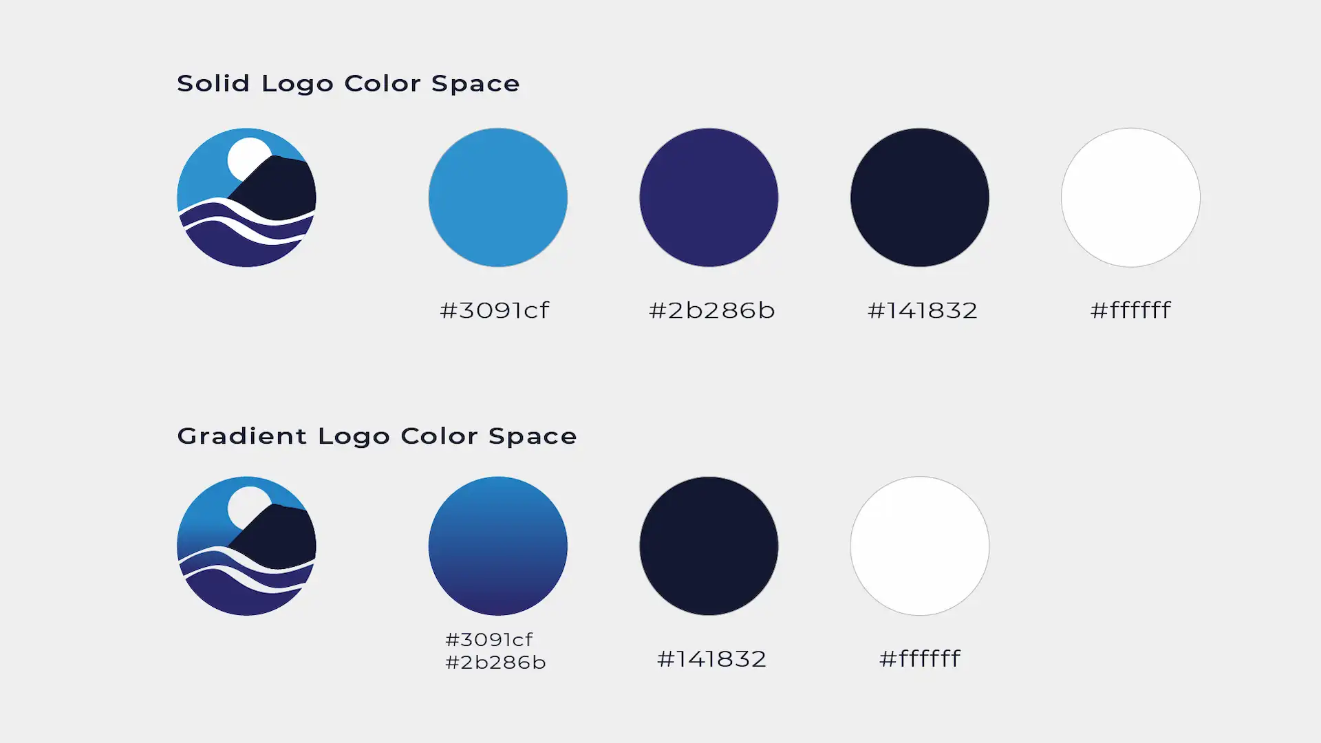
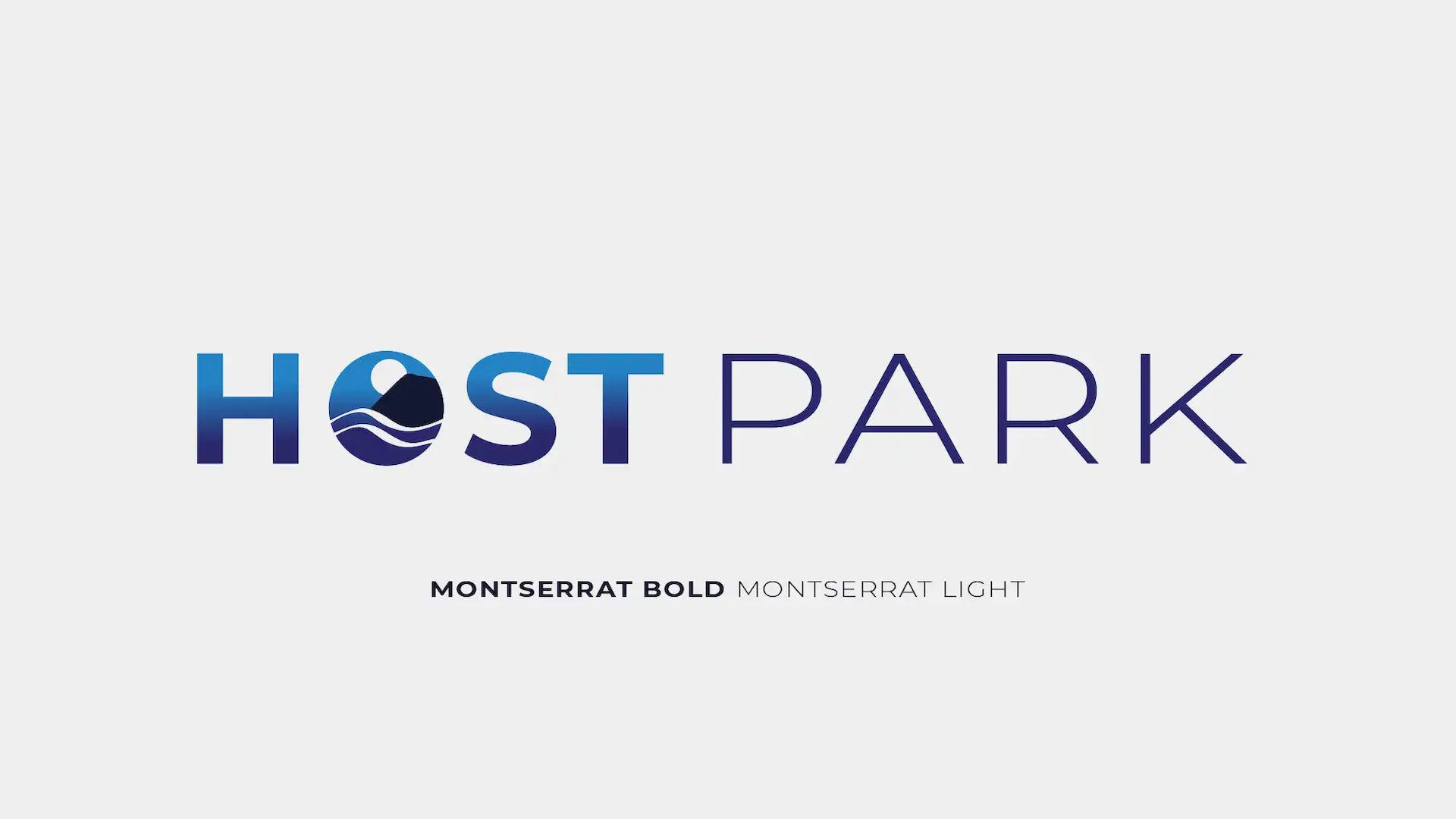
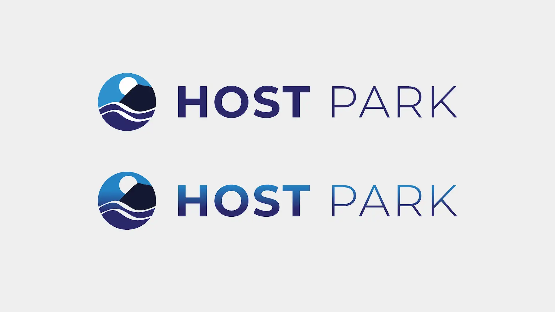
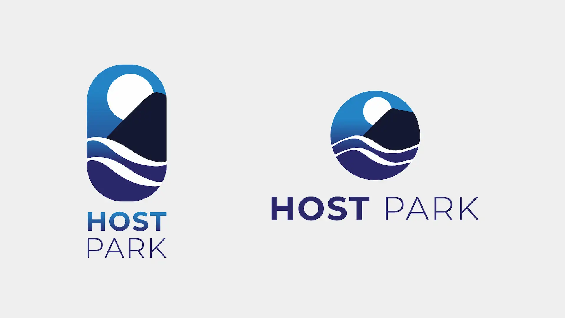
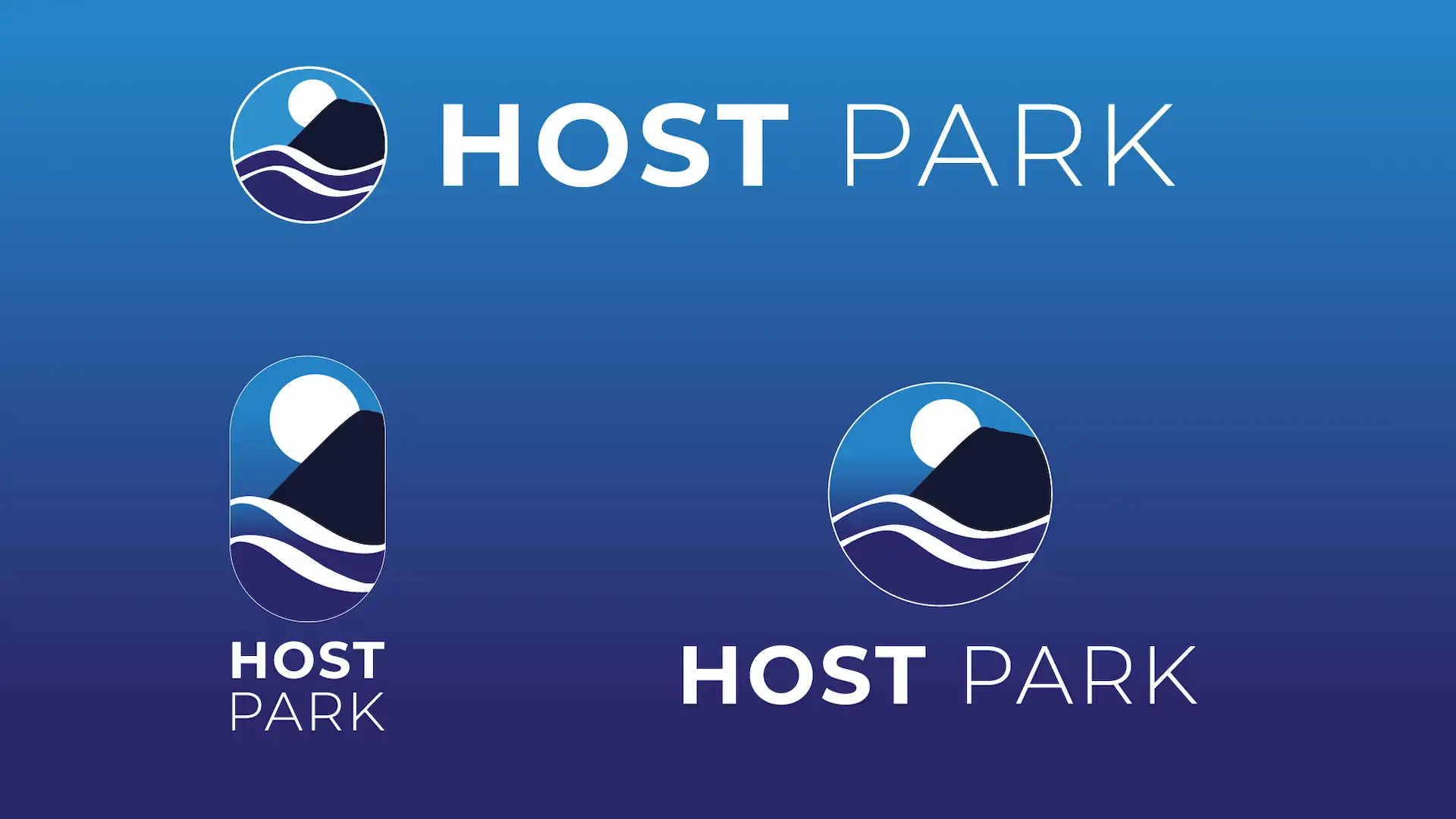
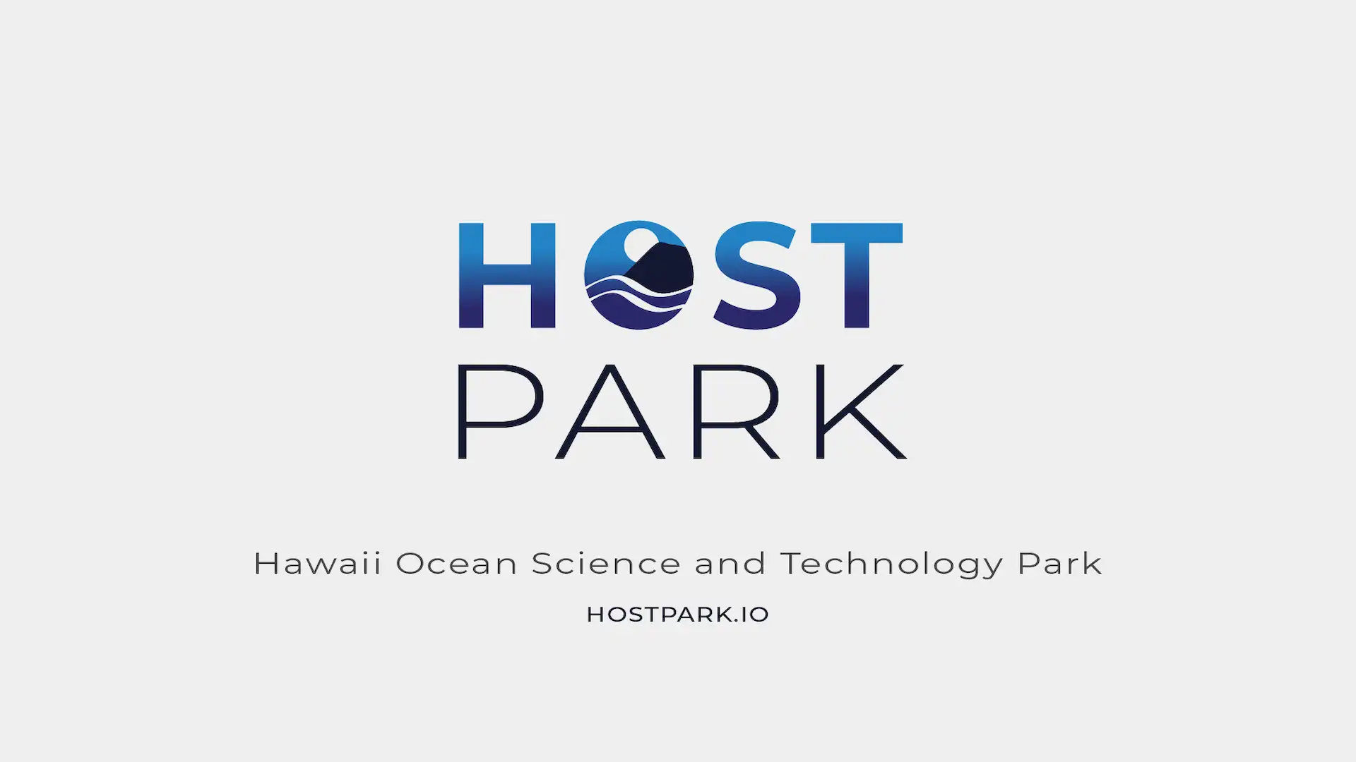
The wordmark uses Montserrat, the existing brand font, for consistency. The final logo system includes multiple presentations: a version with the wordmark stacked below the glyph, a hybrid version where the circular logo replaces the "O" in HOST, and variations with full gradients pulled from the original NELHA color palette alongside flat-color versions. The gradient treatment was integrated throughout the website to create visual cohesion across all touchpoints.
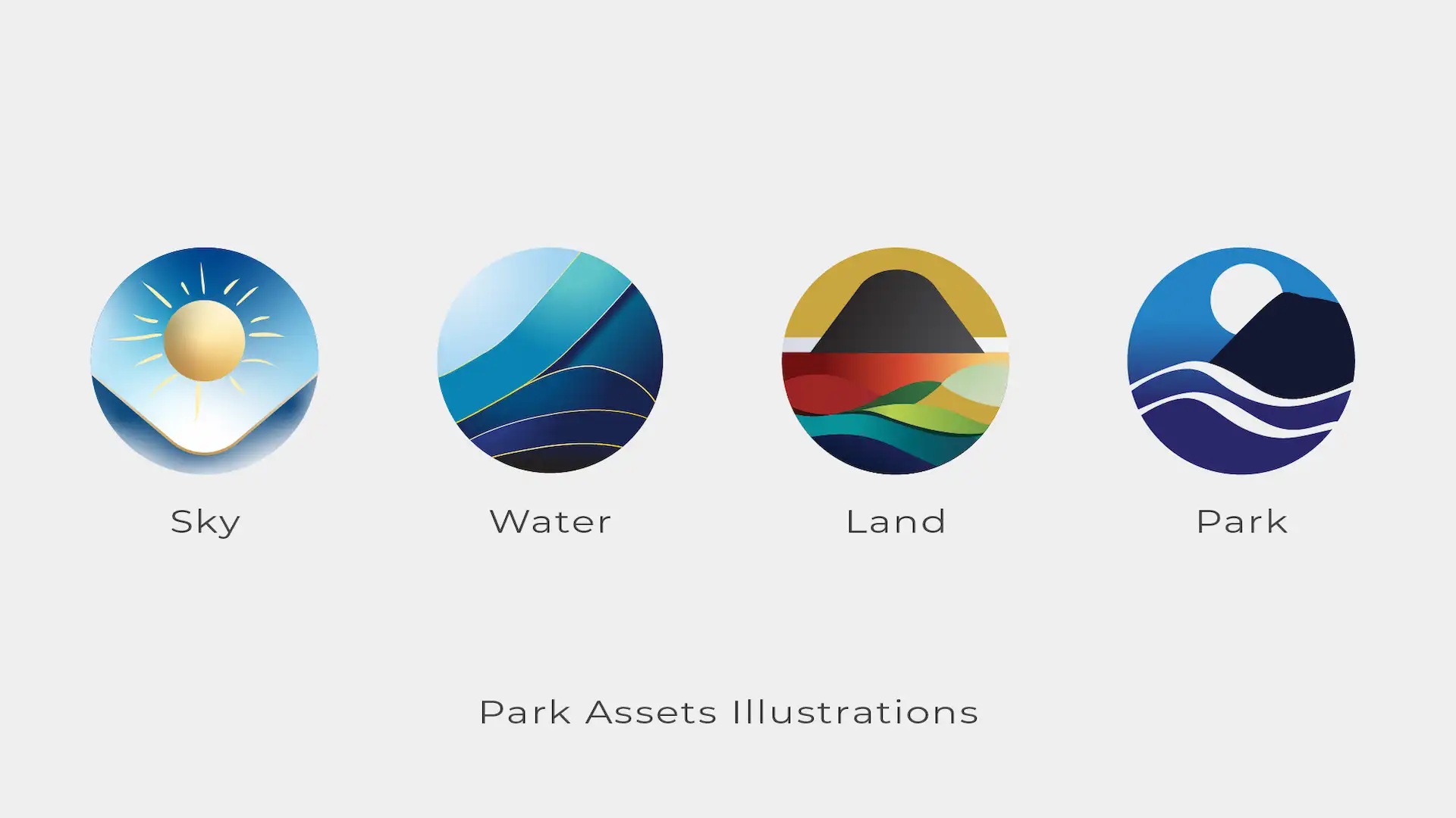
I also created a set of custom illustrations for the Park Assets page, representing Sky, Land, and Ocean resources. These illustrations use the same circular clipping mask as the logo, reinforcing the brand system and creating a unified visual language.
On the website, the header features the hybrid wordmark with gradient lettering and the glyph replacing the "O." The footer uses the stacked version with the glyph above a white wordmark. The flexibility of the logo system allows NELHA staff to adapt the branding across different contexts without losing consistency.
This work wasn't in the original scope or budget, but I made the call to allocate resources for it. The NELHA staff were very happy with the decision and the results.
The main challenge was preserving the recognition and equity of the original NELHA logo while establishing a distinct identity for HOST Park. The logo needed to feel like an evolution, not a departure, so I focused on maintaining the original geometry and color palette while introducing new flexibility through the circular form and wordmark variations.
Extending the mountain and ocean line work required careful attention to the original vector structure. The goal was to make the clipped logo feel intentional and balanced, not cropped or incomplete.
Creating multiple logo variations that all felt cohesive required testing across different contexts: website headers, footers, print materials, and digital presentations. Each version needed to work at different sizes and on different backgrounds while maintaining visual consistency.
The Park Assets illustrations needed to complement the logo system without feeling repetitive. Using the same circular clipping mask tied them to the brand identity, but each illustration had its own character and purpose.
Full logo system including wordmark treatments, gradient variations, and Park Assets illustrations.