A custom 3D illustrated map showing HOST Park's deep seawater pipeline system. Created using GIS data, Blender modeling, and composite illustration to transform technical engineering diagrams into a visually compelling infrastructure graphic.
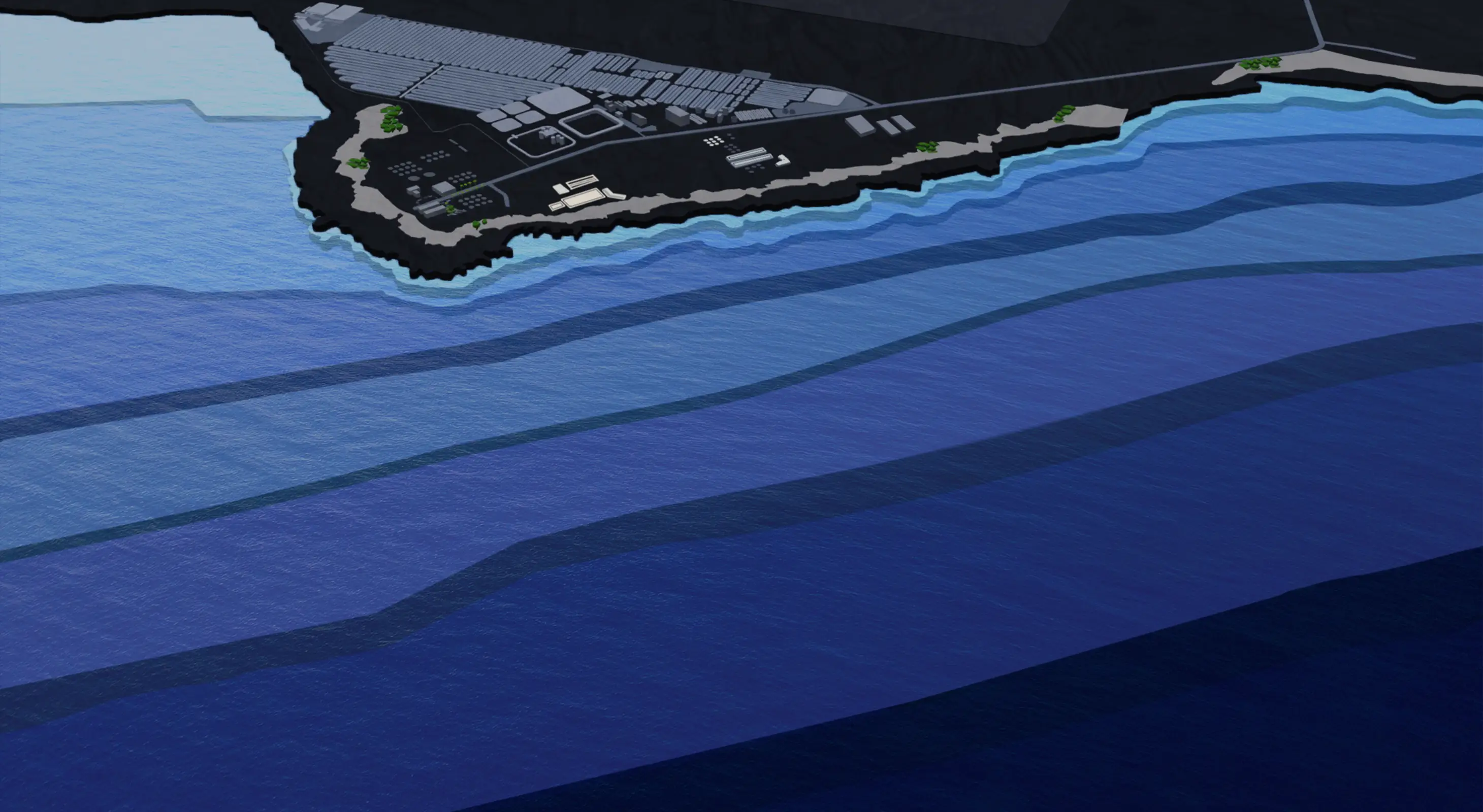
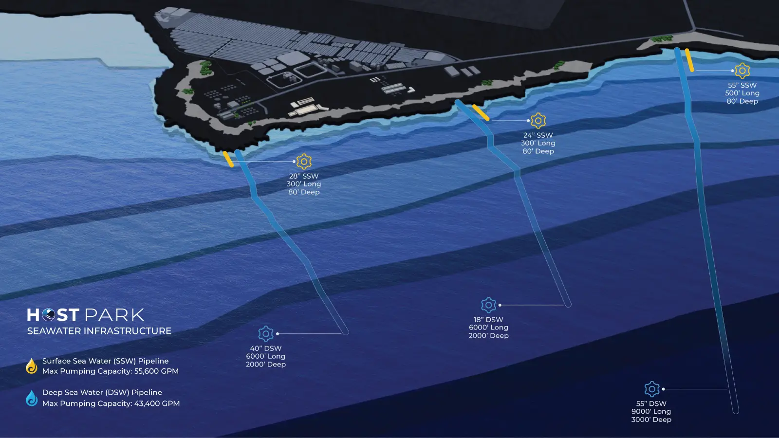
HOST Park's seawater infrastructure is one of its most valuable assets. The park provides access to both surface seawater and deep seawater from offshore pipelines, which support aquaculture, research, and renewable energy operations. NELHA had existing maps, but they were flat, engineer-drawn diagrams overlaid on satellite imagery. Functional, but not inspiring.
I wanted to create something that communicated the scale, depth, and uniqueness of the system in a way that felt dynamic and three-dimensional. The goal was to make the infrastructure visually legible while also creating something that would stand out in presentations and marketing materials.
I started by importing GIS elevation data and pipeline shapefiles into Blender. The plan was to use real bathymetry data to model the ocean floor, but the data was too complex and heavy for the scene. Most of the imported height data caused performance issues and made it difficult to work efficiently.
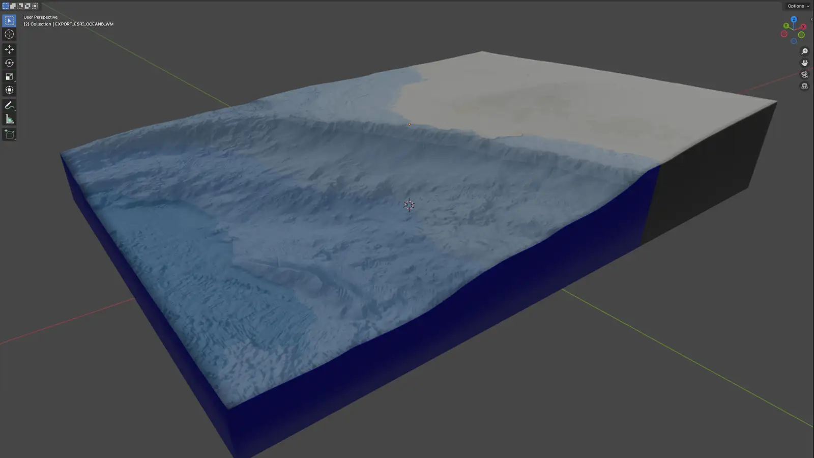
I pivoted to importing shape layers from Mapbox and manually modeling the underwater shelves in Blender. I offset their heights and extrusions to create a stylized representation of the ocean floor that balanced accuracy with visual clarity. After an internal review, NELHA pointed out that the shallow regions didn't hug the coast correctly and instead extended north. I made those corrections in Photoshop by painting over the affected areas rather than remodeling the geometry.
I composited a sea surface texture lightly over the water areas to add depth and visual interest, and designed custom icons for the pipeline intake points and infrastructure labels. The final image was assembled in Photoshop and refined in Illustrator to ensure clean typography and scalable vector elements.
The result is a map that clearly communicates the technical infrastructure while also feeling polished and presentational. It's been used across HOST Park's website and outreach materials.
The biggest challenge was working with GIS and bathymetry data that was too complex for real-time modeling in Blender. The imported elevation data caused lag and made scene navigation difficult, so I had to abandon the fully data-driven approach and manually sculpt the underwater topography based on reference maps.
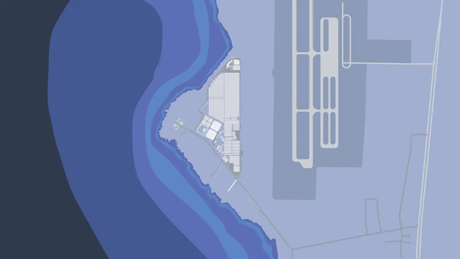
I also experimented with Spline.design to create an interactive, browser-based 3D version of the map. The goal was to allow viewers to explore the campus, bathymetry, and surrounding area in real-time, with the option to view it in augmented reality on iOS devices. The Spline version doesn't include the pipeline infrastructure and uses the earlier, incorrect bathymetry data for the northern coastline, but it served as valuable R&D for exploring how the map could be experienced interactively.
Balancing accuracy with visual clarity was another challenge. The map needed to communicate real infrastructure locations and depths, but it also needed to be stylized enough to feel engaging and easy to read. I worked closely with NELHA staff to ensure the technical details were correct while maintaining the illustrative style.
Compositing multiple software outputs into a cohesive final image required careful layer management and color consistency. The 3D render from Blender, the painted corrections in Photoshop, and the vector labels in Illustrator all had to come together seamlessly.
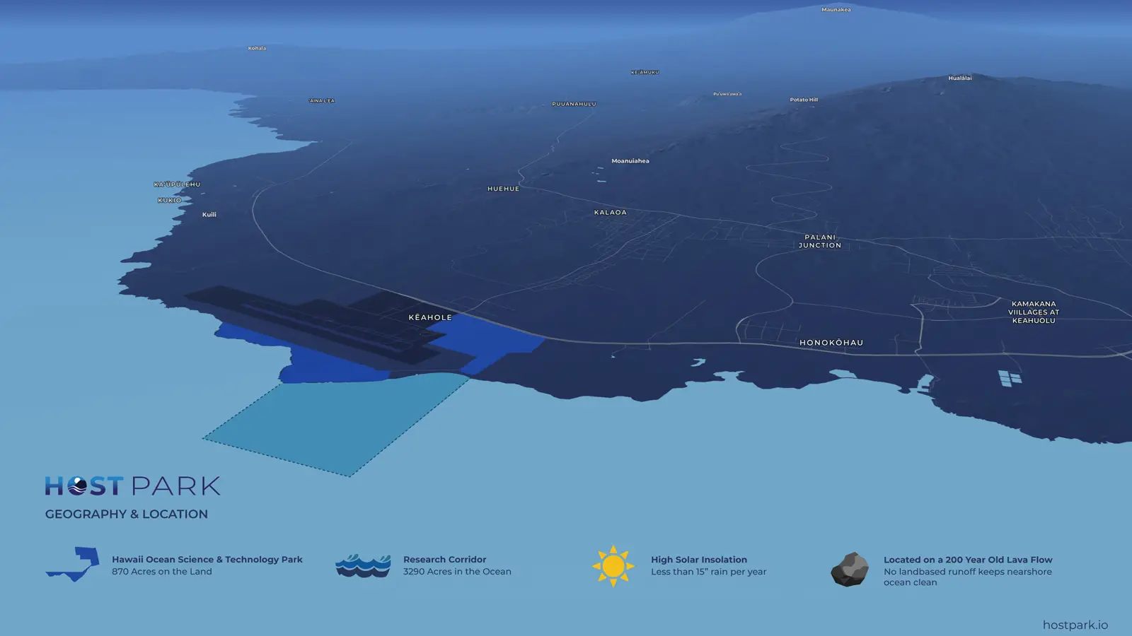
Blender renders, early drafts, and the final illustrated map showing the deep seawater pipeline system.