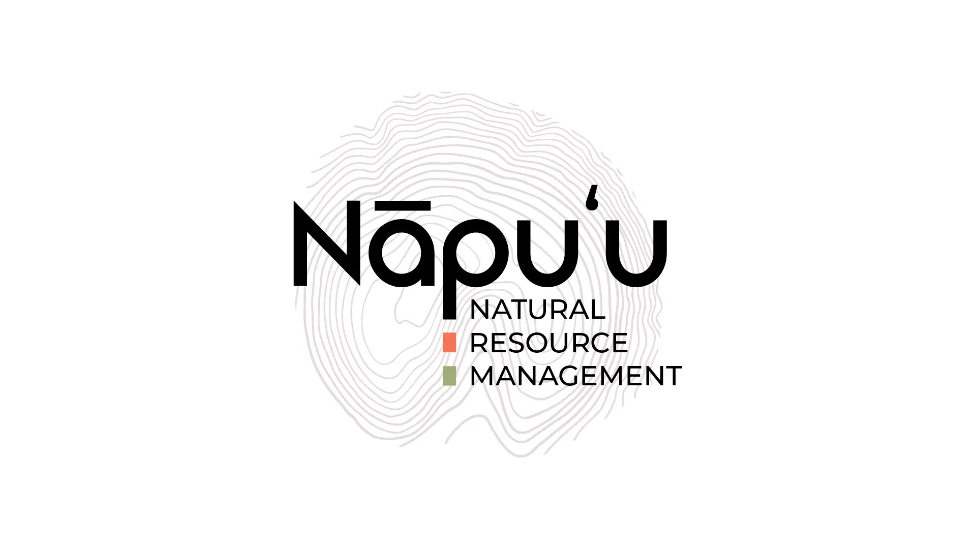
A comprehensive logo system and visual identity for Nāpuʻu Natural Resource Management. Based on topographic contours of Puʻuwaʻawaʻa, the identity includes multiple logo lockups, color variations, typography, and flexible applications for print and digital use.



Nāpuʻu Natural Resource Management operates a native dryland species greenhouse and manages restoration efforts at Puʻuwaʻawaʻa. They needed a visual identity that connected to place, reflected their conservation work, and provided flexibility across different applications.
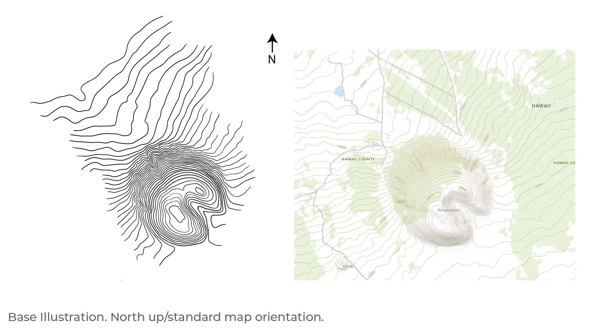
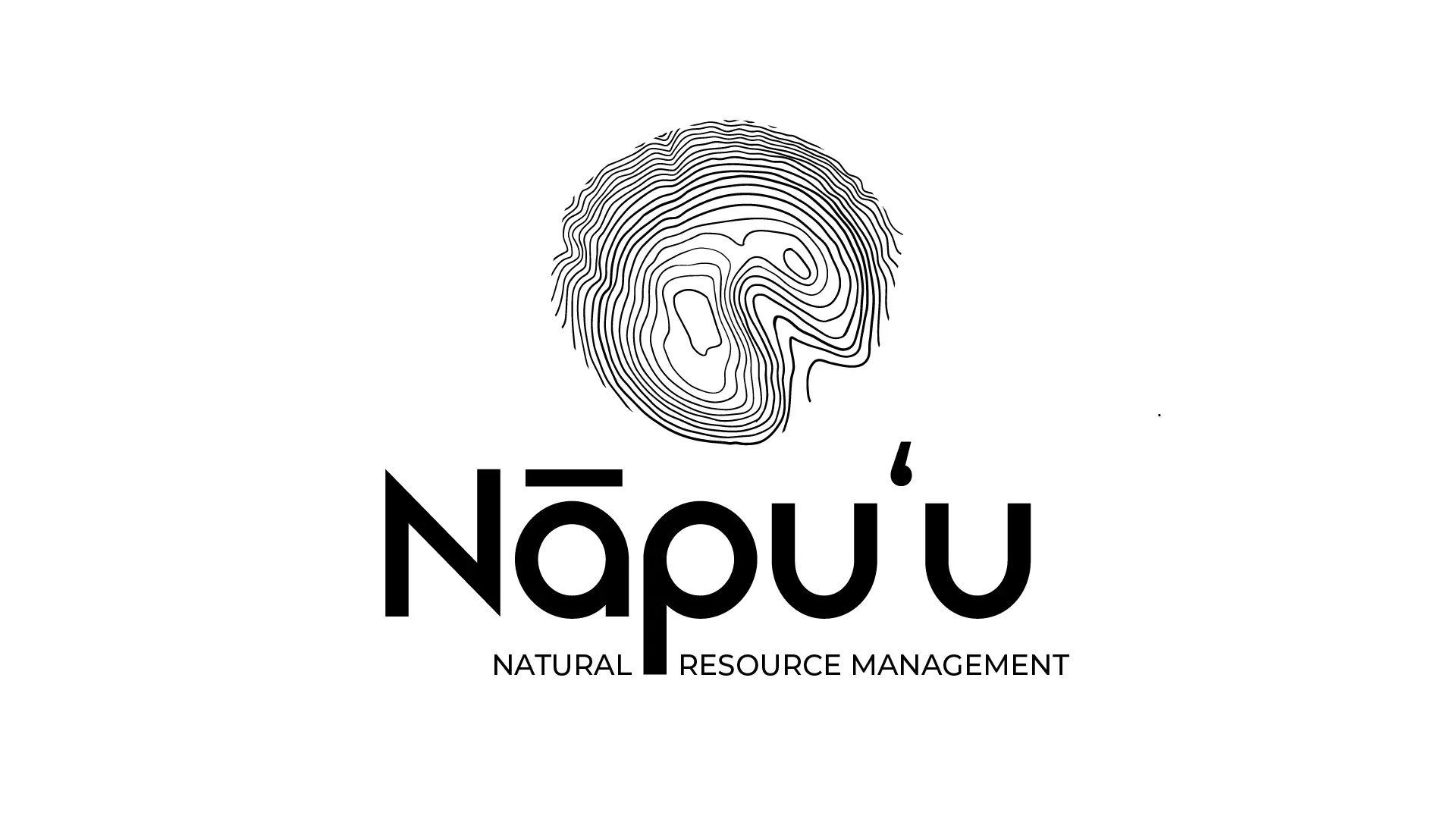
I designed a logo system built around topographic contour lines derived from the actual elevation data of Puʻuwaʻawaʻa, the puʻu (hill) they manage. The contour lines form a circular mark that reads as both a topographic map and a fingerprint, symbolizing the unique identity of the place and the hands-on work of restoration.
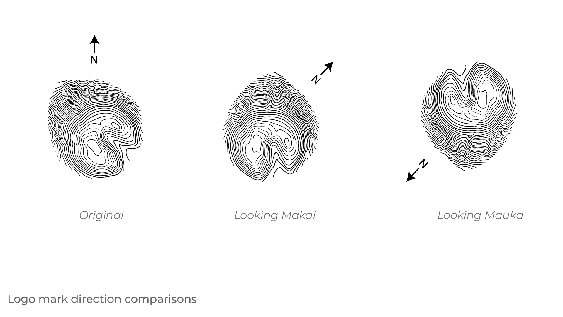
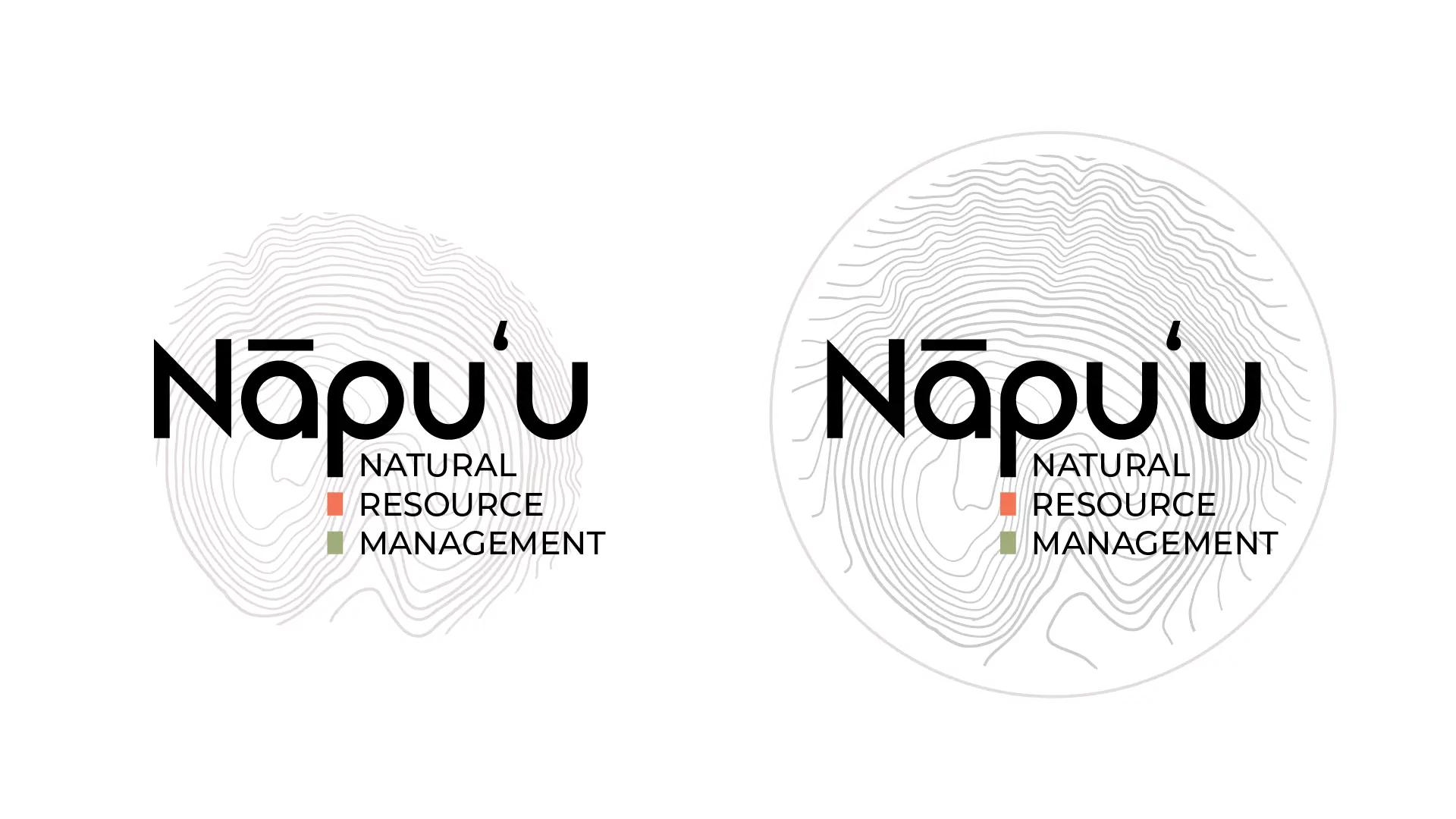
The project included extensive explorations of orientation (makai-facing vs mauka-facing), mark variations (thumbprint, moon, shaded moon), typography (Cayano Pro and Montserrat), wordmark styles (standard and rounded custom ligatures), and capitalization options. The final system offers multiple logo lockups including stacked, horizontal, and condensed versions, as well as glyph-only marks for flexible use.
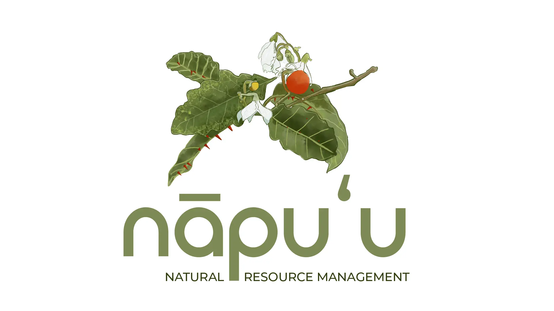
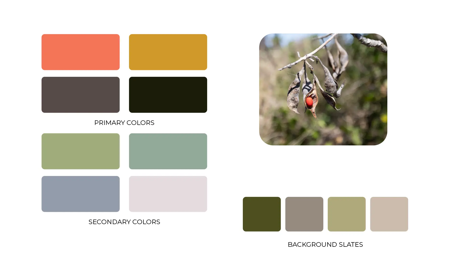
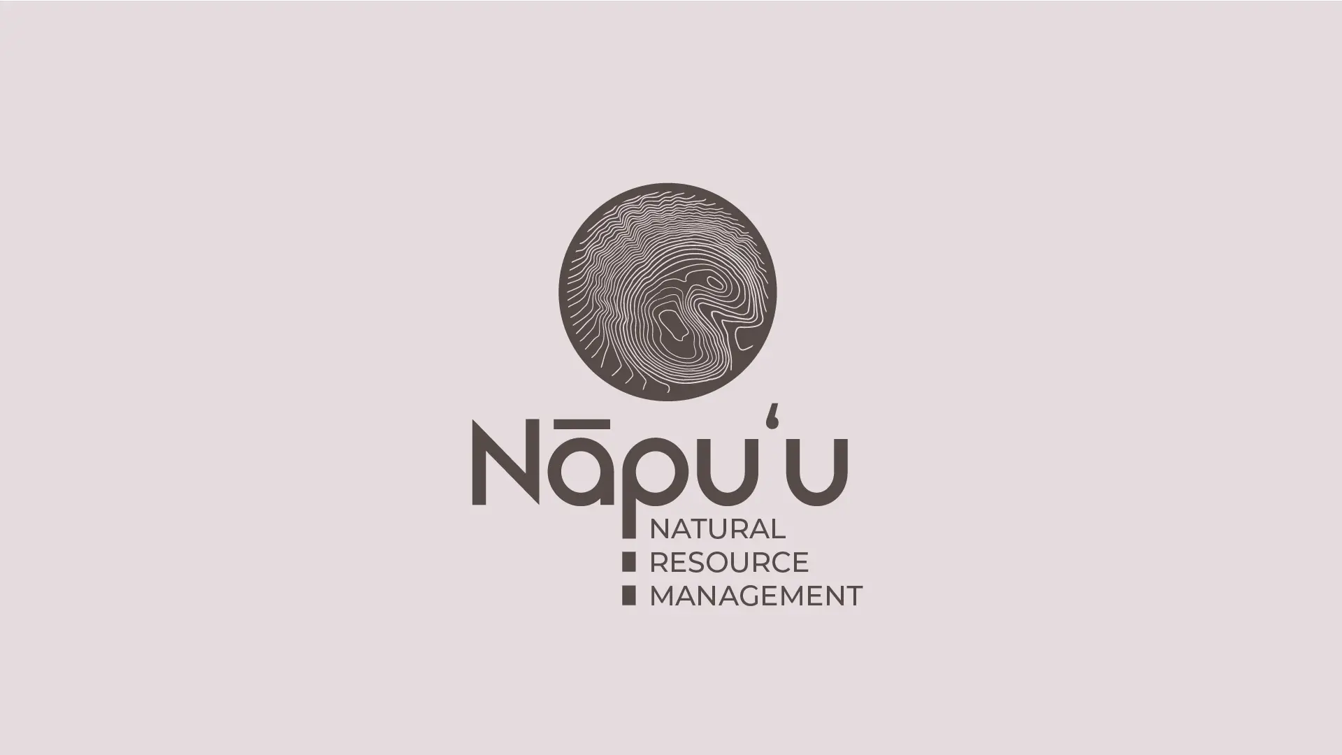
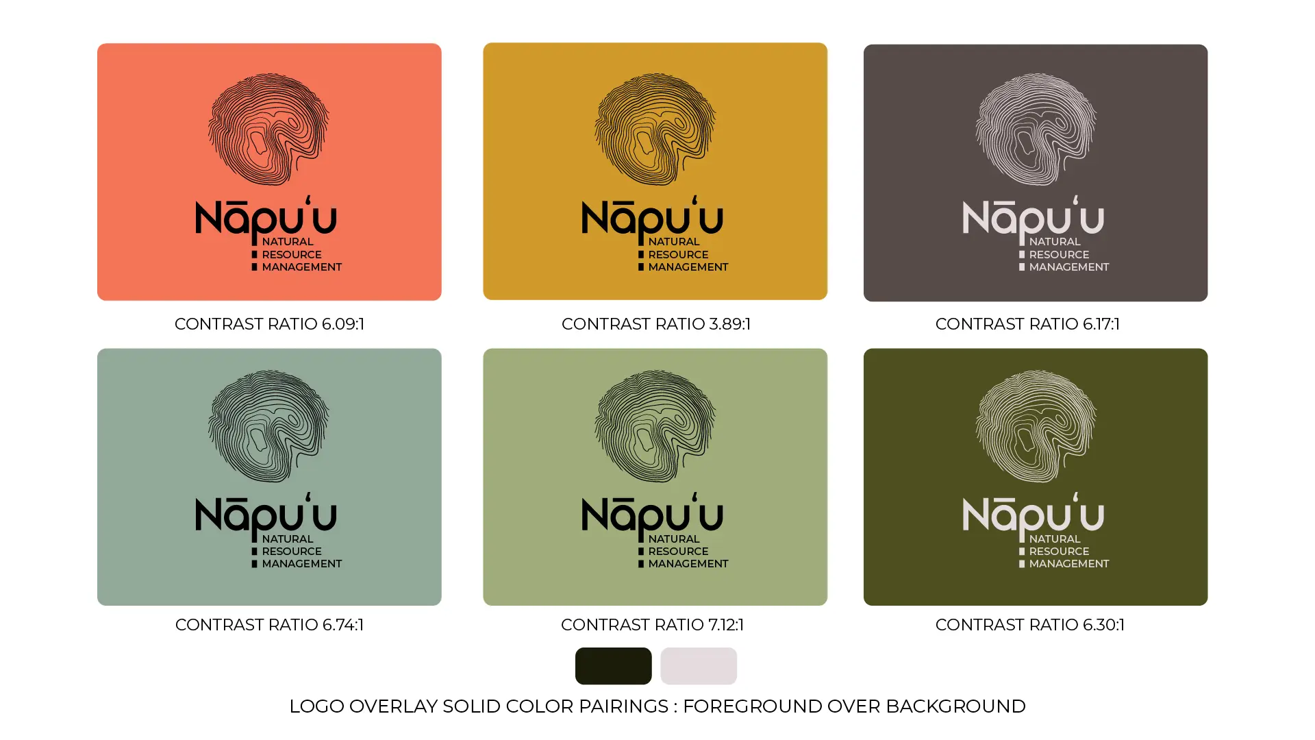
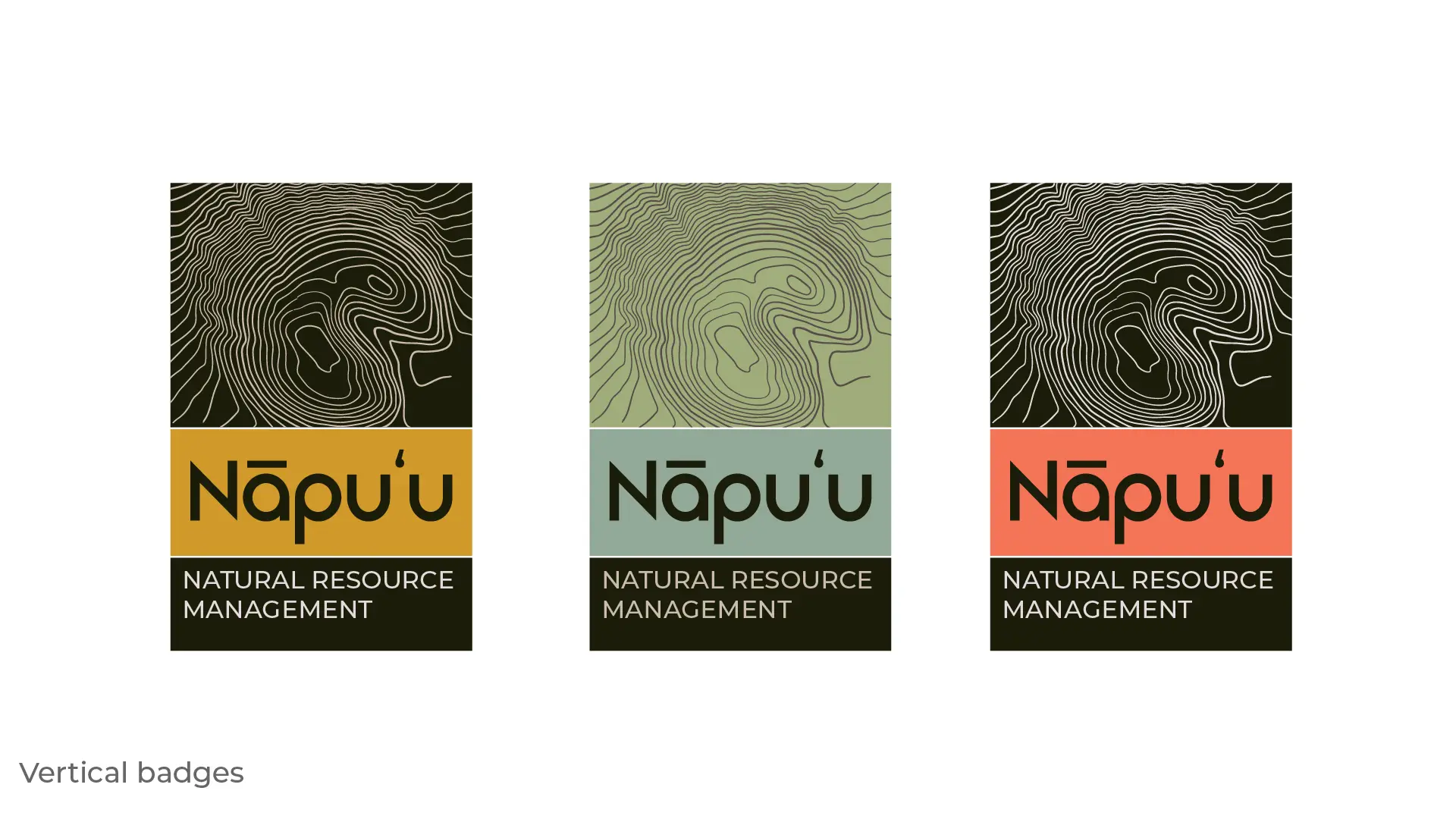
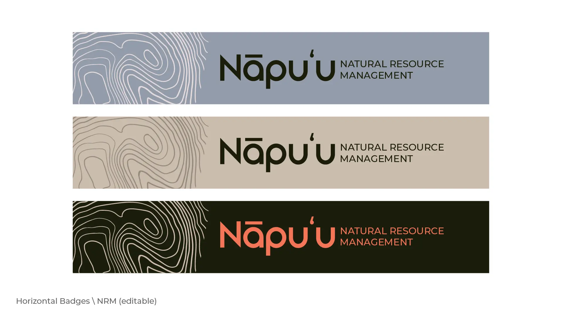
I developed a natural color palette pulled from the dryland landscape: earthy browns, sage greens, coral accents, and deep forest tones. The system includes badge formats (vertical, horizontal, and overlay styles), inverted versions for dark backgrounds, and coloring page line art variations for educational use.
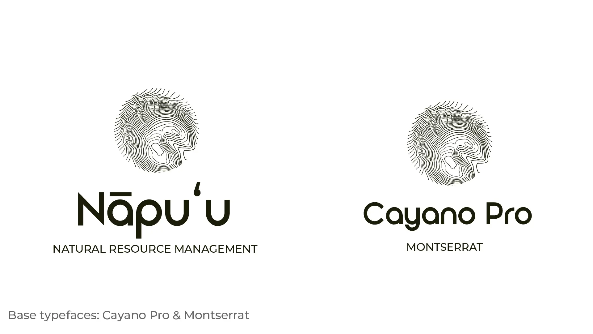
Typography pairs Cayano Pro for the wordmark with Montserrat for supporting text, creating a balance between organic character and clean readability.
The main challenge was translating the topographic concept into a logo mark that felt both accurate and visually balanced. I worked with GIS elevation data for Puʻuwaʻawaʻa and simplified the contour lines into a form that maintained the character of the hill while functioning as a clean, scalable logo.
Exploring orientation was critical. The "standard" north-up orientation didn't feel as strong visually, so I tested makai-facing (toward the ocean) and mauka-facing (toward the mountain) rotations. The client ultimately chose the mauka-facing orientation, which gave the mark a more dynamic composition.
Typography required balancing Hawaiian diacriticals (the ʻokina and kahakō) with readability and visual harmony. I tested multiple typefaces and created custom rounded ligatures for one wordmark variation to soften the overall feel and tie it closer to the organic contour lines.
Creating multiple logo lockups, color variations, and badge formats meant significant production work, but it ensured Nāpuʻu would have the flexibility to adapt the identity across different contexts without needing ongoing design support.
Logo explorations, lockup variations, color palettes, badge formats, and typography studies for the Nāpuʻu visual identity system.